
Showing posts with label ISTD. Show all posts
Showing posts with label ISTD. Show all posts
Wednesday, 14 December 2011
Friday, 9 December 2011
ISTD - Cover re-photographed
Again feedback back from the final crit advised me to re-take some of the photographs for the cover and have somebody hold and use the slip cover.
ISTD - Re photographed
After the low quality of the 1st shots and after feedback from the final crit I re-shot the ISTD in context with someone interacting and using the publication.
Thursday, 8 December 2011
Grids and typography rules - ISTD
Open publication - Free publishing - More gri
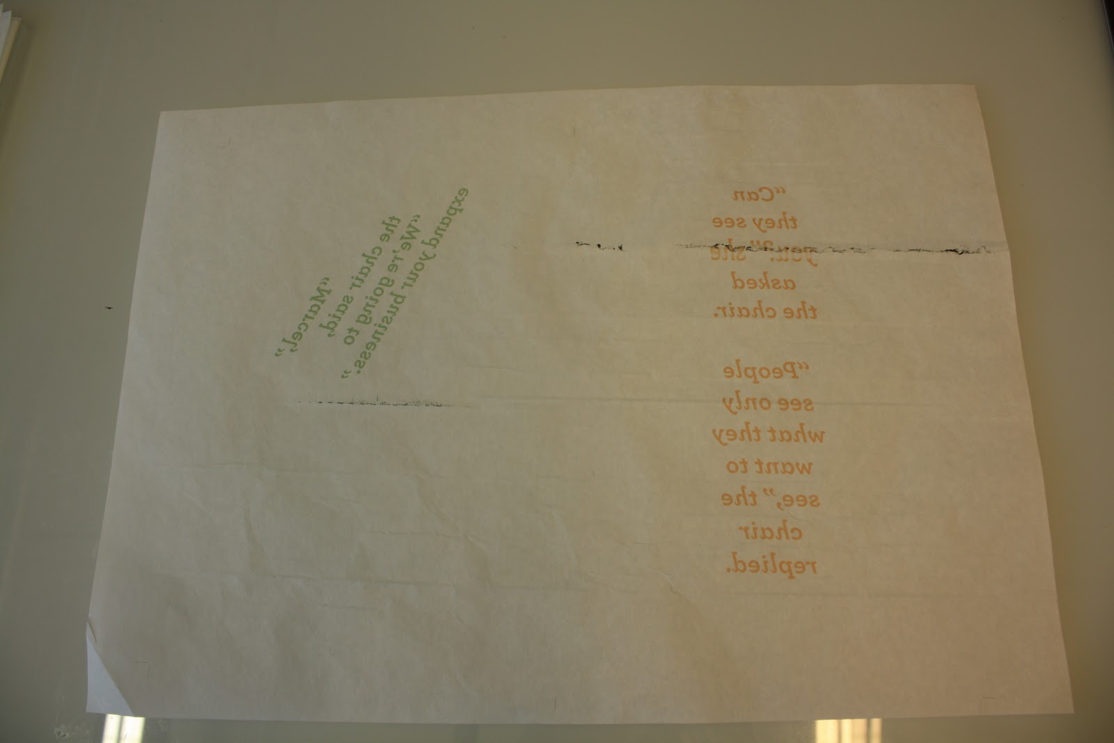
ISTD asked in the brief to submit evidence of typographic skill and knowledge through examples of application. The layout of the publication followed an 18 x 24 grid system where only the pull quotes were allowed to ignore, but this was intentional as they had to be centred on the page to be able to work.
I created a set of rules for how the speech in the text was
distinguishable against the standard text. Instead of indenting the normal paragraphs I instead used a line break to notify the start of a new paragraph and for the speech I used an indent to signify a new character speaking.
Proposed covers for ISTD
Open publication - Free publishing - More covers
These are the chosen designs for the proposed series of covers for The Waitress publication.
Each is a subtle hint to a part of the story. The thread relating to the cloth and the waitress sewing, the knife and fork as the setting is a restaurant and the dollar bills for the money that the waitress discovers in her purse.
Wednesday, 7 December 2011
Final shots of ISTD magazine

Tuesday, 6 December 2011
ISTD Cover development


Moving closer to a final design for the slip cover, for the project I'm going to propose a series of covers this may include this design in various colour schemes or proposals for separate designs. The idea came from simple line drawings that started to form a chair but contrast with the title 'the waitress' giving a subtle mystery to the cover.
ISTD Cover mock up development.
I went back to basics with this idea, I needed to get away from a computer screen so made some analog layers of type and image to test out different layouts. I think I'm going to do this more often as it was so much quicker than messing around on software. I'm happy with this idea as it fits the story well and is quite a minimal design which lets the content speak for itself, I needed to create something that wasn't too 'noisy' to make an impact on the concept of the magazine.


Concrete poetry cover idea


I experimented with the idea of using one of my original ideas from the beginning of the ISTD brief and using concrete typography and using letters from the inside of the magazine and projecting them onto the front sleeve to form the title of book and the author, however it didn't quite work as the point size was too small and the transparent stock just didn't suit being a slip cover.
Cover Idea - ISTD - development


ISTD Cover Ideas
Several rough ideas for the ISTD Slip cover, I'm trying to keep it minimal and primarily typographic. I've also still to decide on the stock, not sure if to stick to the transparent paper or move onto a thicker stock to give a more sturdy feel to the publication.


ISTD Publication - Bound (stapled)
Some quick shots of the bound publication, more directed product shots are to follow but just needed to record my process of producing and binding the magazine. The only issue I'm having at the moment is that the publication is difficult to read through more than two pages unless there is a light source behind the magazine. However the concept of the magazine and the layout still allows it to be read page by page like a conventional publication and the concept can still be understood when you reach the centre spread.


ISTD - publication before binding.
Just in case anything went wrong with binding and cropping the magazine I documented how the publication should look and how it functions and also how the pages work to form a double page spread.


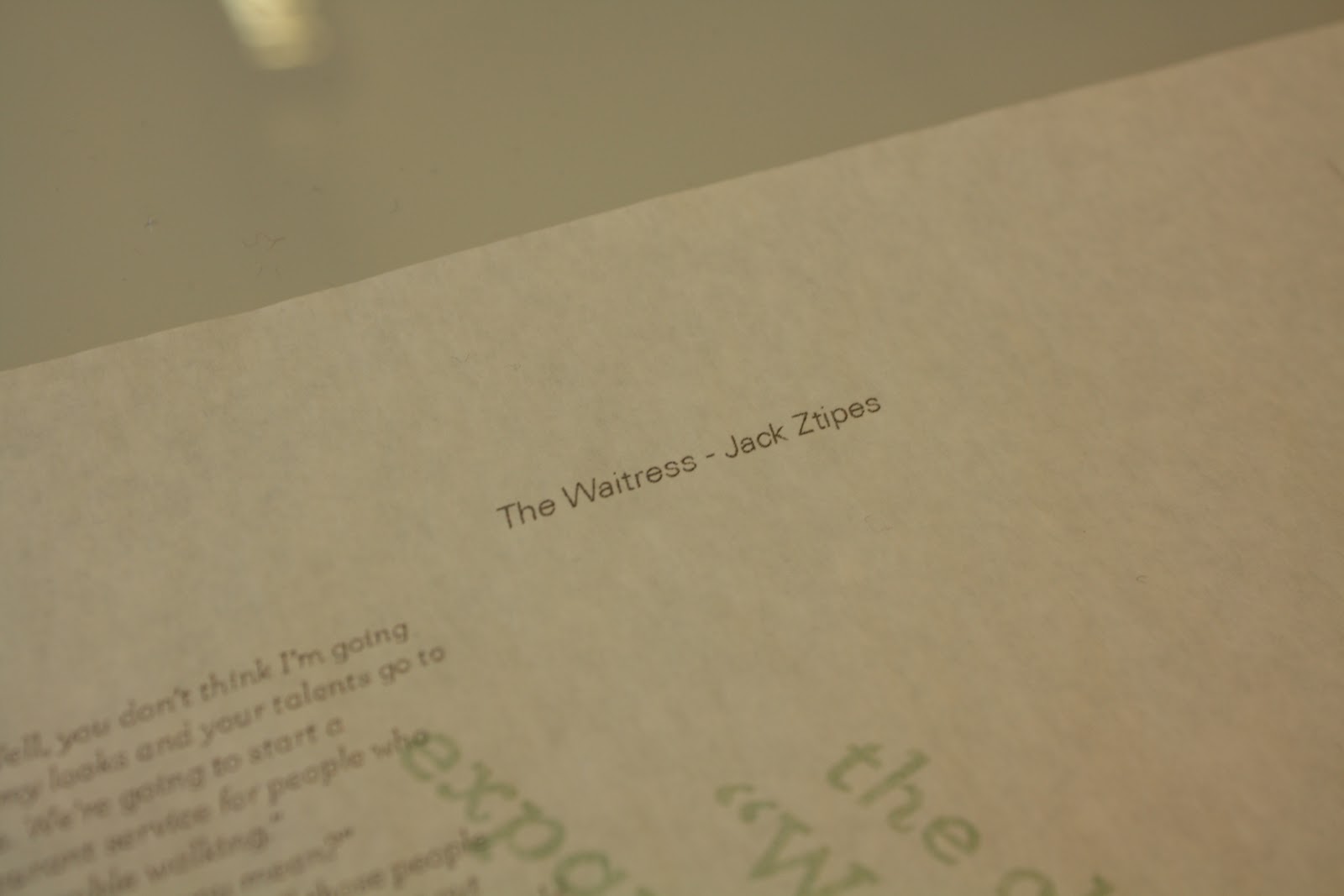
ISTD Publication - Printing errors and typos
I knew before sending this publication to print that there was a high possibility that they'd be problems due to the thin weight of the stock that I'm using, so the expected happened and the printed chewed up one of the spreads but surprisingly only happened once. So after re-printing the spread and having everything else printed I noticed there was a huge typo in the header of the centre spread where I'd spelt Zipes 'Ztipes', unfortunately it was the same spread that I had to reprint the 1st time so that had to be re-done. So far these are the only problems I've had so fingers crossed everything goes well from here.


Istd Mock up
Open publication - Free publishing - More mock
The 1st prints came out okay, had to manual feed it through an inkjet at home. They was obviously a few mishaps but a few changes in the feed settings sorted that out. The stock works great, the transparency is just perfect.
The 1st prints came out okay, had to manual feed it through an inkjet at home. They was obviously a few mishaps but a few changes in the feed settings sorted that out. The stock works great, the transparency is just perfect.
Monday, 5 December 2011
ISTD Publication page numbering soultion
Finally come to a solution of how to number the pages, I've decided to use graphic elements instead, below is an example of how the centre fold should look and at the foot of the page sit 7 lines each representing a different page that contains content. Each line will sit on a separate page and as the reader progresses through the magazine the lines will be spaced to subtly represent the stitching of the chair, this was a considered design element and I wanted to somehow visualise the fabric element of the story whilst also being as functional element such as page numbering.


Barcode page numbering idea


Saturday, 3 December 2011
slip cover idea - ISTD

Progressing from the belly band idea I started to think about having a slip cover that was 3/4 or 1/2 the size of the magazine. The slip cover could have die-cut letters to reveal the publication inside or be the same stock as the magazine and be transparent or even be thick stock to make it more sturdy and be embossed.
Cover and belly band idea


I was visualising how the cover would look when I started to think that the transparency of the paper would look good as a cover with all the layers forming a shape of different opacities. So I developed the idea of having a belly band which had printed on the front and back the title and details of the concept of the magazine.
Friday, 2 December 2011
Red Rooster development
More development for Anna's Rooster tail promo/branding and after a few mock ups I started to veer towards the same style I used for the 'office space' promo. It suits the project and fits with the conecept we're sticking with but I'm a bit wary that it could turn out to be a bit to similar unless that is what we go for and the colour and slight difference in ration is what distinguishes that two projects. Will have to discuss this with Anna and get her views.


Subscribe to:
Posts (Atom)