
Showing posts with label brief two. Show all posts
Showing posts with label brief two. Show all posts
Wednesday, 14 December 2011
Friday, 9 December 2011
Wednesday, 7 December 2011

Monday, 5 December 2011
Printed rooster tail Flyer

Final printed resolution for the Rooster tail flyer. Pretty happy with the outcome and got some good feedback from around the studio. I've also started to realise I'm using different typeface for each project, which had been done deliberately to suit each project but I wonder if I could somehow implement a type rules into her brand such as certain type for body copy etc.
Friday, 2 December 2011
Rooster Tail promo development
Just a few samples of the development I'm working o at the moment for the Rooster Tail Promo. I started by using the Office Space flyer as a model and worked on from there and quickly moved in a new direction. I changed the typeface as Orator now didn't have any connection to Rooster Tail and chose Aller for the headings instead and volkorn for the body text.


Rough ideas for Flyer layout


Anna's brand
Anna's project brands are slowly and smoothly clicking together we're both happy to go in this direction and at the moment they work quite well together and I can't wait to take this over to Anna's actual brand.


Red Rooster development
More development for Anna's Rooster tail promo/branding and after a few mock ups I started to veer towards the same style I used for the 'office space' promo. It suits the project and fits with the conecept we're sticking with but I'm a bit wary that it could turn out to be a bit to similar unless that is what we go for and the colour and slight difference in ration is what distinguishes that two projects. Will have to discuss this with Anna and get her views.


Split box development
As we wanted to keep with the theme from 'office space' I started to experiment with the new split ration and testing out different dashes and shapes.


Reply from Anna and amendments
Anna replied saying that she loved the one below but wanted the image on the back to be bigger so I amended that and sent it back off and got an instant reply saying it was perfect for her.


Quick turn around - business card - rooster tail
Anna wanted a quick business card designed within a day for her Rooster tail project, so I got straight to work playing around with the split page idea and sent them straight off. Her only preference was that she wanted an piece of work included and standard contact details.


Thursday, 1 December 2011
Ideas for Rooster Tail promo
We wanted to take the split format into the other projects as this was a style she used if a little different in the ratio. Below are my (very) rough thumbnails of some ideas and a piece of work from the Rooster tail project. The dashed lined worked with the 'office space' but I don't want to repeat that I'll test it first but I want to use the split concept in a different style.


Wednesday, 30 November 2011
Gallery Window Vinyl


Window vinyl development
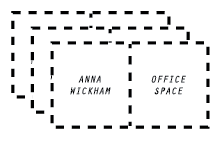


I had to keep the window vinyl quite simple and not be too 'loud' when placed in a gallery window but still stay true to the design direction of the project. From my rough ideas I took several forward into digital experimentation and reflecting on them now I can see that the box that is completely dashed is the strongest so I'm going to take that forward and use that one.
Tuesday, 29 November 2011
Window Vinyl Ideas
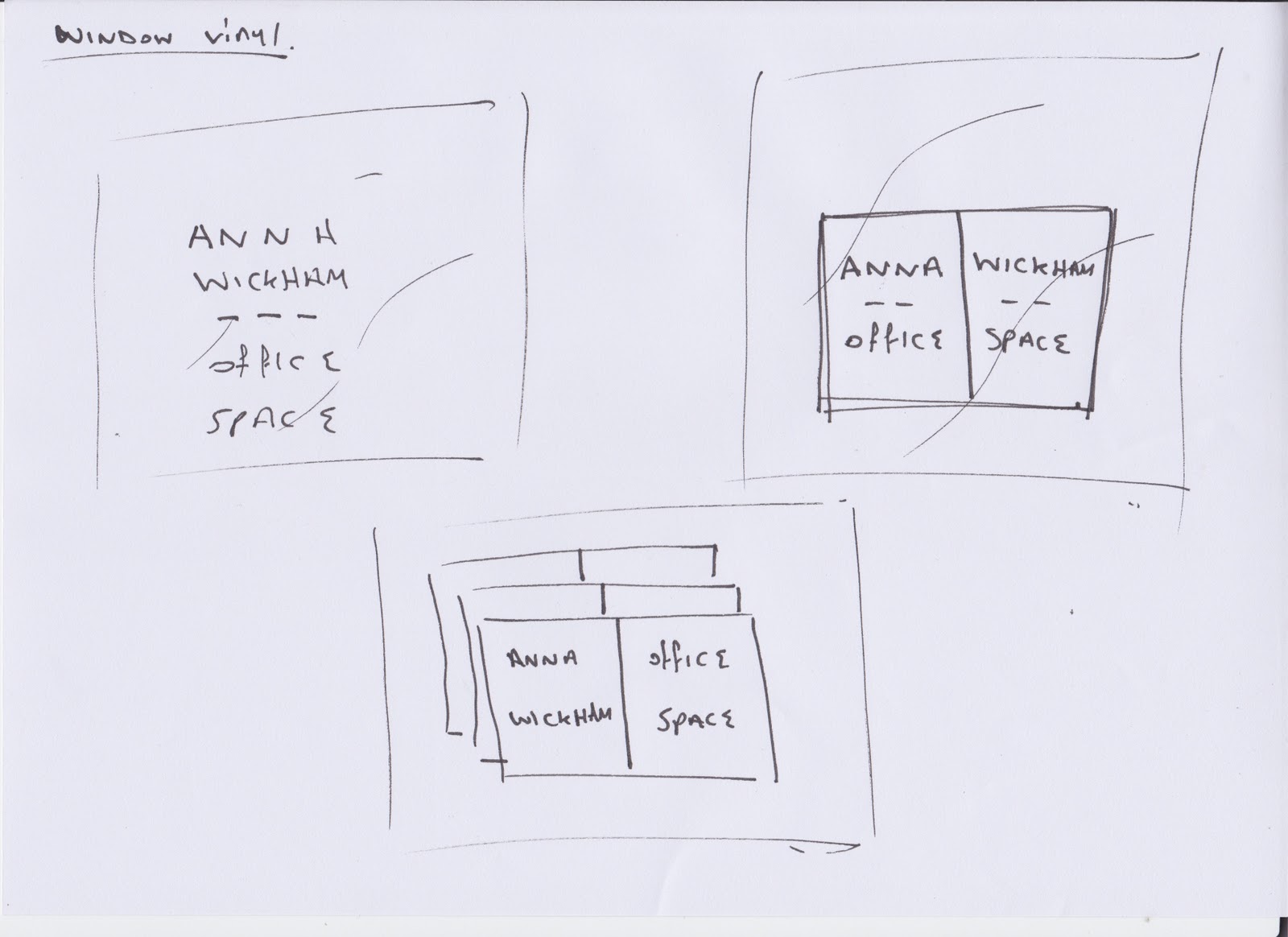

Beach London have a tailored window vinyl for each exhibition, usually it is just a few lines of text or even several words but I wanted to push the idea of the exhibition branding further and extend it to the window vinyl.
Wednesday, 16 November 2011
Flyer for Anna's Exhibition
This is the final design for the flyer, I've had feedback from Anna and she loves it. So I'm not going to change this design and I've been asked by Anna to take the split format across to her other project promotion and even try and work it into her branding.


Exhibition flyer development
It was back to the drawing board with this one and I really dived into it after making some rough thumbnails. I knew the kind of style Anna was into and after having a brief chat with her decided to stop playing it safe and experiment and go crazy even if it turned out wrong. i really had fun with this and a few good designs came out of it that Anna liked, she favoured the green to the pink and loved the dashed line element and preferred the full bleed on the reverse with no added graphics.


Subscribe to:
Posts (Atom)