Tuesday 27 October 2009

Visual Language session 4

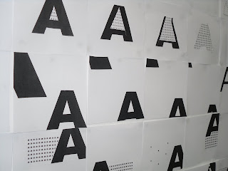
Our aim for this session was to produce a letterform from separate layers (fields). Similar to the channel 4 identity ads. Below is our final outcome, not as smooth as we would of preferred but near enough, we found it harder than we anticipated as the space between each layer manipulated the thickness of the stroke, so resulted in us having to alter each layers stroke which was a pain.


An example of how much hassle we caused ourself by cutting it out individually, pretty much guess work on the thinkness of the stroke but its turned out much better.

The layers that formed the finished letterform.

Before we began.

Alphabet soup - typeface for paul

For this brief I was asked to design a typeface for Paul inspired by the answers given to a questionnaire. I choose to base the typeface around his answer to the question 'what would your super power be?' which was the power of 'Foresight'. I then listed four words to work around, which were; Foresight, Energetic, Adventurous, and Experimental.

Each letter is formed from the typeface 'Modern no. 20', some of the strokes have been replaced with pen and ink circular shapes to form a pattern visualizing a constellation.
Below: mock trial of final idea
Rough visuals.
Below: the typeface, (modern No. 20) that i manipulated.
Visual Research into 'Foresight'

Alphabet soup - part one (Edit)


The brief for this project was to produce ten letterforms that communicated a single word, the word that i was given was 'EDIT' i started by evaluating the word edit and sourcing as much as i could from brainstorming and then went onto experiment with my ideas visually.


I made the mistake of not exploring further with my ideas but with the short time given i decided to experiment with the concept of using editors markings and lines to from a letter and adding little notes and measurements to support the idea.

These are my ten final designs.


Visual Com session 3

In Session 3 we were asked to communicate Scale using the letterform A on 5 10x10 cm squares, then we swapped our designs with someone else and then using there originals designed 3 more for each of the 5 they had created. Below is one of the 5 sets of four that i created. I did the task a little wrong as i interpreted the task was to create 3 design inspired by the original and not to specifically make a sequence... oh well.


Below (the middle set of 4) is the sequence created by the person who used my 5 original designs, the 1st in the sequence being my original design. This is how i was supposed to complete the task, by creating a sequence of scale, so that the design appears to get larger or smaller.


Sunday 25 October 2009

OUGD101 - How To...

For our 1st studio brief we were given the task of solving a given problem, ours was student debt and money management. Through group brainstorming we wen through several ideas which lead to developing an idea that focused around a deck of card, each suit representing a different form of how students spend their money. For example hearts represented health, which includes food and other such things, diamonds represented fashion and style, spades represented work and tips on how to find work or help on your c.v, and finally clubs which represented nightlife and socialising. Each card gave a fact or hints and tips on how to save money. Due to my absence on the final day in which we were to design the resolution, i did not partake in the design so in the near future i will be posting my own version of the cards. Below are two examples of the groups final designs and the supporting idea development, however everyone went on to design their own as we felt this design didn't do the idea justice.


Thursday 22 October 2009

Visual Language session 2

This week the brief was to communicate 4 keywords through a series of 4 canvases and then produce a final piece inspired by that series.

Dissect.


Jumble.

Add Image


Hybrid.


Tuesday 20 October 2009

Visual Language session 1

Our 1st session in visual language totally made me think differently about how to use and communicate type, it challenged my way of visually representing words and meaning as we only had one letter to work with although we did have several typefaces and point sizes. I did enjoy it though and learnt how to work with letterforms differently.

Summer Brief