Showing posts with label brief three. Show all posts
Showing posts with label brief three. Show all posts
Wednesday, 14 December 2011
Sunday, 11 December 2011
Final design of the website
Really happy with this now and quite looking forward to actually designing the site over the next few weeks after the deadline, realistically theres not enough time before the hand-in to start and finish this website.
Saturday, 10 December 2011
Web page development
I played around with the homepage and tried some experimental layout but it just wasn't working out so I stuck with quite a formal layout with the work and about at the top and my logo in the top left corner.
Sunday, 4 December 2011
Saturday, 3 December 2011
Snask email pdf
It's a bit out there but after reading Snask's blog I felt that this channelled their sense of humour perfectly (hopefully) This came about after John organised us to send Snask a email pdf trying to get an internship in Stockholm, Sweden.
Graphic elements - self promo
Wanted to push the imagery further with the decagon and thought that a few inspired graphic elements would go perfectly with stationary and other mediums to compliment the logo.
Friday, 2 December 2011
Impossible shapes
Had a quick idea to make a decagon inspired impossible shape....... it was impossible. I spent a good 3 to 4 hours cutting pieces of paper or drawing decagons in 3d and trying to cross edges and create an illusion of an impossible shape. It could not be done or not in the time I spent on it.
Getting there - self promo
Thursday, 1 December 2011
Re-developing original logo
After a few failed experiments I went back to my original logo (which I still like but could be better). I love decagons so I started to play around with the weight and realised I definitely wanted to keep this element in my re-design. However i do not like georgia bold anymore so that it out. After a few quick tests I found I really liked having one heavy weighted decagon not too sure about the rough edged D though.
quick idea
A really quick idea that popped into my head, a little bit too european for me I think, it's probably looking at all these Dutch/German/Portugese blogs. I do like the colours though, I may adopt the orange, plus its the colour of Dutch (Netherlands/Holland)
Symbol mark development
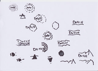
Again some interesting results from experimenting with symbols inspired by my initial, however it still doesn't quite feel right.
Logo type development
Tried developing the symbol idea for my logo type with some interesting results but I don't think it realyl communicates me as a designer, plus there not very good.
self promo logo idea generation
Subscribe to:
Posts (Atom)


