>I based my designs on one of my favourite geometric shapes, the decagon; a ten sided polygon. After this decision it made it easier for me to experiment with simple shapes and line.
> I took inspiration from the watch on my wrist; a blue 'color coded' swatch watch. I researched more into the watch and the 'color coded' range and sampled colours from each watch to create my own swatch range.
The Design process//
>After experimenting with shape, line and colour I finally came to this design. I decided to use Dutch as my brand; most people know me by this name and I think it will catch peoples attention more than just a usual name. However I did place my real name below so that all associated work and blogs all linked together and lead back to this identity. I still see it as a work in progress and I plan to re-visit this later but for now I'm happy with the direction that I'm going in//
I'm planning to send a mailshot to several New York studios titles 'New Yorkshire'.
I've several ideas on what the mailshot is going to be, one being a piece of card (4″ x 9″) with the 'new yorkshire' logo cut out of acrylic and stuck to the face of the card with my blog/web address printed/embossed/foil blocked underneath. At the back of the card there will be a fold out stand similar to a photo frame.
Hoping to produce some testers by the end of next week if time permits.
1. Fedrigoni//Bring Fedrigoni’s versatile range of papers to life to ensure they’re the paper of choice for existing and new customers. This brief would allow me to produce print based material but would also see how I could promote the campaign across other mediums.
2. Green & Black's//Give new consumers a motivating reason to trade up to Green & Black’s. I like how this brief is completely open to interpretation and there are no limitations on what medium I choose to use or explore. The brand has very strong beliefs and ethics and I think it would be exciting to transfer those elements into the design process and see what the results are.
3. Marks & Spencer//Create a visual identity for our Plan A campaign and develop campaign elements to bring your identity to life. i really want to challenge my design process with the effects of applying the sustainability factor and this would push me further because of it's scale in terms of the size of the business and market. I also like that it's a branding based brief and i'd like to further my skills and portfolio in the are of branding.
These are the final images for the Guardian Editorial brief. The Q&A formed out of bones came was inspired by the articles subject on x-rays so i went about researching bones and sketching various limbs and spines which eventually came together as letterforms.
The 2nd image is very simple and is related to a statement in the article which discusses that people believe that if you save n something small you can buy something big in the long run; trade you daily latte for a widescreen tv.
The 3rd image is for the article 'relationship maths' and so I used a mathematical equation that equals as I<3U, text speak for I love you. I then took that equation and laid it out so it formed a heart shape.
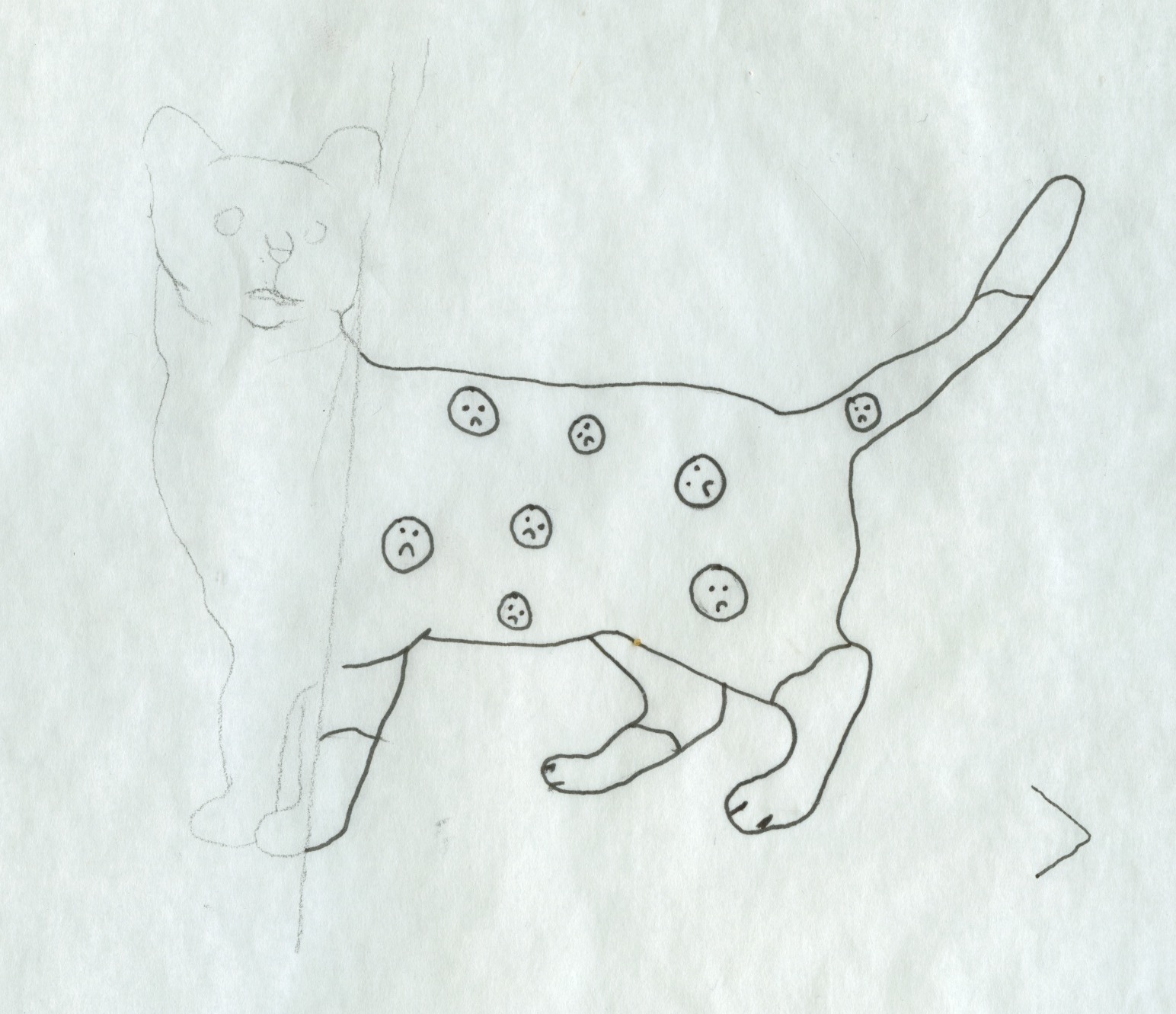
The final Image above is for Tim Dowling's Guardian column, I took inspiration from his resolution to be kinder to animals and is plan to put sad stickers on things that displease him.
This Module was the first experience I had of designing for screen; it was a learning curve in terms of using a new program and new time considerations such as rendering and uploading/converting. Before this module I was adamant that I wasn’t comfortable practicing motion graphics, it was too technical and that digital media wasn’t my style. However, after the first brief [silent movie] and several tutorials with Mike, it became clear that bringing motion to still images wasn’t too complex or out of my capabilities.
Skills Acquired/Developed
Obviously the biggest skill I can take away from this module is my new knowledge of After Effects. I can now navigate the basics and animate assets and manipulate them how I want them to. If I were to go back to the silent movie brief I think I wouldn’t find it as challenging as I did at the time, I struggled at first to understand controlling key frames and manipulating the given words. I don’t think I was confident with applying some of the tools that I experimented with such as the camera or using 3D layers. If I was to go back I would apply these techniques more confidently, I think I made the mistake of keeping things too simple and not challenging myself enough, but because I was handling new software I went for the safe option.
Storyboarding was the biggest skill that I developed, producing ideas quickly and communicating them fluently onto paper. The storyboarding process made visualizing my ideas easier, especially when working with moving elements. I’m really happy with how I developed the speed of generating ideas and transferring them onto storyboards. Translating ideas to visuals is something I've discovered I'm comfortable doing. I found out that even putting weak ideas down helps the process of developing concepts and ideas and getting the weakest ideas out of the way tp concentrate on the stronger ones.
The final stage of the module allowed me to produce packaging for the DVD. I felt that I hadn’t fulfilled my potential in the print module and wasn’t happy with my final packaging, so I wanted to use this opportunity to produce a really nice piece of packaging that I was proud of. The packaging that I ended up creating was based on a book and I think it was relevant to my subject. [top ten Brothers Grimm fairy tales] I also applied techniques that I regretted not using in the last module such as foil blocking.Although I enjoyed making the packaging and using the foil blocking process, I didn’t give myself enough time in case something went wrong, which is exactly what happened, I made the book before I printed on the canvas so the foil blocking process went wrong, but it wasn’t a complete disaster as I did like the final outcome even if it was accidental, all of which went towards developing my crafting skills which I’d like to progress with.
Strengths
In the top ten brief I really felt comfortable story boarding and communicating my ideas. In the crits I got positive feedback on my concept and the direction I was taking my ideas in and I was also happy with the tone and atmosphere that I created in the videos mainly the background elements.
I also think that the idea behind the packaging was strong and that I’d like to redo it and possibly use it in my portfolio. Finally I think I’m improving at annotating and commenting on my design practice blog, something I’ve struggled with in past modules, but I’ve found that it benefited me when looking back on my ideas and progression.
Weaknesses
I feel that technically, my videos aren’t very strong and that I should of applied more effects or added more motion to the characters and how they walked.
Even though I’m improving every module my time management is still not at a level that I’m happy with as it greatly affected the standard of my videos. I also spent several days on my image module which is much more time than i should have spent.
I think this module has made me realize what kind of designer I want to be and what I want to practice. Although I’ve enjoyed learning new skills and software I still don’t think that motion graphics is something I want to pursue. However I think that it was important that I did a motion graphics brief so that I was able to experience a different discipline.
> My Packaging was inspired by the format of my top ten, Books. The Brothers Grimm made their trade from writing and publishing their stories in Books. I chose to use Baskerville as it looks and feels mature and in the right context, aged.
After making an error in producing the book before foil blocking I was adamant that I was going to scrap the whole thing and produce a new one from scratch, but with time restraints and utilising time to manage after effects and blogging I decided that the finished product wasn't as bad as I first thought. I can take away from this that I now know to print onto the woven material first and also a new technique and effect which I can apply to book design//
> The foil blocking process didn't go as smoothly as intended, because I'd made the book beforehand when we put it under the heat press the PVA glue melted and came through the woven material//
> The nice people in the print room let me have the foil for free and so I foil blocked the remaining area of the cover so the mistake wasn't so obvious. The result isn't too bad, it isn't what I wanted but in terms of time I'm happy to use this as my final packaging design//
> Just finalising the Rapunzel Ident. Needs a solid layer at the start to fade away and possibly tweak the timings but other than that I'm quite happy with this.
> This is almost complete, I just have to tweak the timing of the wolf's position, he moves into view too early and starts animating halfway through.
>Unlike the other idents, I needed the character to stop walking (on the spot) and move with the environment and allow the other character (the wolf) to move into view as if Little Red Cap had stopped walking as soon as she saw the wolf walking towards her.
> I retimed the positioning a little so the wolf comes onto the screen just has the limbs start to animate.
> To sync the movement of the wolf with it's limbs I moved the centre point of each limb to where I imagined it to be connected to the body (as if it was a joint) and altered the rotation over time. I also applied the puppet pin tool, which I had been experimenting with and found that I could place pins on the legs where the joints would be and move the legs as if they had natural movement. It still isn't as fluid as a real moving wolf but I think the effect gives more life to the animation and is as realistic as a silhouette is going to get.


