I have developed many skills from this module, including the 'proper' way to kern type, which I applied when designing the Identity for my fictional company and how to manage colour such as 4 colour printing and being precise what the finished printed colour will be in contrast to the colours on screen, knowing my limitations with CMYK. I've developed a more hand on approach to design, drawing my ideas out more often, putting ideas onto paper and illustrating concepts gives me a clearer idea of how things will look. At the beginning of the module i found myself concentrating on context more than practice and after several weeks, i had an idea of what direction I was heading in but no visual evidence such as design sheets but as soon as I started sketching it all seemed to come together much quicker. My drawing skills aren't the greatest but they have developed through practice. Another practical skill I developed was hand craft such as putting nets together and embossing, which I enjoyed greatly. The embossing process is a great aesthetic in design which I put to use on one of my posters. I also developed my research abilities, and found that I'm good at creating a clear and definite route from a topic to ideas to concept to ideas, for example, my 'good' was originally colour and through colour theory research I investigated colour association which lead me to researching foods that disobeyed our natural colour association, 'odd coloured foods' was then my 'good' which lead me creating a grocers and so forth.
I found that my strengths in this module was developing an identity that was right for the company and it's market, I felt that the logo was sophisticated, colourful and possibly one of my best pieces of design work so far. Researching into relevant packaging also appeared to be a strength and extracting ideas from that research. Yet I do regret not utilising the time I had on this brief, I feel i could have experimented with foil blocking and created more visually interesting promotional print and a larger range of packaging. My time management skills are getting better but right now they just aren't good enough, I'm discovering the designer inside of my and I'm growing in confidence but when I look back I feel that if I'd of applied myself more I would be a much better designer, luckily for me I still have time.
In the future i plan on utilising all of the time given in the brief, sketching and drawing out my ideas from the beginning of my research, experimenting with more print processes and developing more design ideas instead of just the first few that pop into my head.
Tuesday, 23 November 2010
De-bossed poster
Friday, 19 November 2010
The concession stand
Thursday, 18 November 2010
Saturday, 13 November 2010
Poster designs

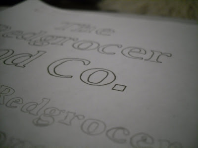
Above I had the idea to deboss the names of the fruits and vegetables so that the names of the colours were dominant and that the foods would be read unexpectedly.


These flashcards were a developed from the one below and instead on saying what colour it was show them, weirdly enough whatever red you use on a carrot it always seems orange... colour association.
Friday, 12 November 2010
Another crate box
Thursday, 11 November 2010
Logo adapted

I thought that I'd adapt the logo so it can be used across a vaster range of products, packages and promotional print. I removed several foods from the image and changed the lucinda bright from demibold to regular, and arranged it so it fit underneath the artwork. The original logo, which will still be used would of had difficulty being printed onto all formats and still being a functional identity. This way I'll have more options when it come to designing the packaging.
Logo colour tests
Logo Development

(8451A1)
My final identity for the moment, I may come back to it in the next few days and amend somethings that I'm not happy with, such as the neatness and sharpness of the olive coloured leaves.


Green as a trial colour, I thought that it was too closely linked to normal organic foods and not odd coloured foods which I'm Packaging.


I did a simple edit of the kerning and spaced some of the characters out such as the 'O's' in the food and the 'Th'. I really think that it's made a big effect on how the Logo type looks.
This was a simple experiment whilst I was colouring the roots and leaves of the fruit and veg. The ear of the 'g' looked similar to some of the leaves I'd drawn so I separated it from the body and colour matched it.


The developed version of the ear, which I think works well with the design and product.
Wednesday, 10 November 2010
Sunday, 7 November 2010
The Redgrocer food co.
The Redgrocer food co. is a fictional farm shop company that I've set up that sells odd coloured fruit and veg. The aim of the company is to persuade people to break through the colour association of food and not to be cautious or put off by the colour of foods that aren't usually that colour such as black garlic or purple potatoes. These odd coloured foods also happen to be much healthier than the normal versions. The company will have concession stands in premium food halls such as Selfridges and Harvey Nichols. The audience will be wealthy people who are into food exploration and healthy eating.
Subscribe to:
Posts (Atom)


