Showing posts with label OUGD101. Show all posts

Sunday, 22 November 2009

OUGD101 - N.N.I.G.N BRIEF - poster development

From my feedback given to my finally finished posters, i developed the idea further by removing the bubble type and replacing it with a normal premade typeface, letting the image speak for itself without the type becoming too intrusive. i also added an extra stroke around the world illustration to make it more visually enjoyable.

OUGD102 - illustrator brief

Here are my 26 variations of my typeface created originally for my Alphabet soup brief where my word of design was EDIT.

Saturday, 21 November 2009

OUGD101 - No News is Good News / 3 posters

After going through several ideas and so many changes, i'm really happy with this outcome, i still think i could develop it further and i will do but for the deadline I'm quite happy with this design.

I chose these 2 colours intending to depict the ocean (blue) and the darkness of the unknown (black), my stock was white which complimented the two colours. The illustration of the world represents the known, the discovered, what we have explored. I placed some waves within the illustration highlighted by a black arrow to emphasis the amount that we've explored and the amount that is left unknown. The type is fluid and intends to visualise water and movement in the type only poster I've changed the colour of the 1% and the ocean to highlight the facts.


Tuesday, 27 October 2009

Alphabet soup - typeface for paul

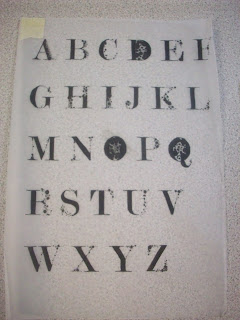
For this brief I was asked to design a typeface for Paul inspired by the answers given to a questionnaire. I choose to base the typeface around his answer to the question 'what would your super power be?' which was the power of 'Foresight'. I then listed four words to work around, which were; Foresight, Energetic, Adventurous, and Experimental.

Each letter is formed from the typeface 'Modern no. 20', some of the strokes have been replaced with pen and ink circular shapes to form a pattern visualizing a constellation.
Below: mock trial of final idea
Rough visuals.
Below: the typeface, (modern No. 20) that i manipulated.
Visual Research into 'Foresight'

Alphabet soup - part one (Edit)


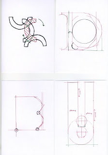
The brief for this project was to produce ten letterforms that communicated a single word, the word that i was given was 'EDIT' i started by evaluating the word edit and sourcing as much as i could from brainstorming and then went onto experiment with my ideas visually.


I made the mistake of not exploring further with my ideas but with the short time given i decided to experiment with the concept of using editors markings and lines to from a letter and adding little notes and measurements to support the idea.

These are my ten final designs.


Sunday, 25 October 2009

OUGD101 - How To...

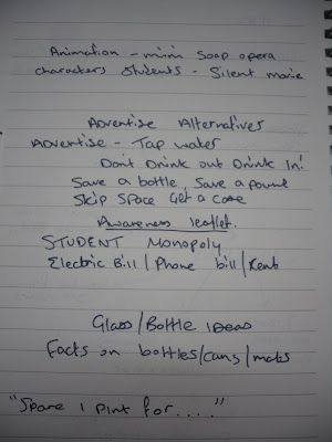
For our 1st studio brief we were given the task of solving a given problem, ours was student debt and money management. Through group brainstorming we wen through several ideas which lead to developing an idea that focused around a deck of card, each suit representing a different form of how students spend their money. For example hearts represented health, which includes food and other such things, diamonds represented fashion and style, spades represented work and tips on how to find work or help on your c.v, and finally clubs which represented nightlife and socialising. Each card gave a fact or hints and tips on how to save money. Due to my absence on the final day in which we were to design the resolution, i did not partake in the design so in the near future i will be posting my own version of the cards. Below are two examples of the groups final designs and the supporting idea development, however everyone went on to design their own as we felt this design didn't do the idea justice.