Monday, 24 October 2011
Website initial rough ideas
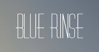
Initial rough ideas for the blue rinse website. I'm going to choose several that I feel are strong and mock them up and see which work the strongest.
Anna's exhibition flyers
After talking with Anna it was discussed that I should go ahead and make a temporary title for the project/exhibit and false dates so I could start laying out mock ups for the exhibition flyers. I decided I wanted to use the backdrops that feature in the project and take them across to the promotional side, I also used Orator Std, a typeface specifically created for office typewriters in 1962 and I felt even though the project is influenced by the 90's era office environment the typeface still echoed the atmosphere of the project.
Friday, 21 October 2011
Wednesday, 19 October 2011
Initial ideas for 80's styled patterns for Pop up shop canvas bags
Whilst being inspired by my blue rinse re-brand project I wanted to use some of the patterns that I'd researched as a basis to design so printed canvas bags.
Tuesday, 18 October 2011
I'm going a little crazy with the 80's
I've surrounded myself with everything eighties (well not quite) I feel I'm getting closer to a colour palette that I can use across the re-brand and I'm still searching for that certain image/style which I think I'm close to below.
Monday, 17 October 2011
experiments with lables
I pushed the idea with the eighties type and applied some electric colours. The results were pretty interesting and had the aesthetic that I imagined. It became clear though that maybe I've gone too eighties, so I'm going to reign it back in again and after speaking with Jane I'm going to experiment with a typeface from one era with a backdrop from another era.
Friday, 14 October 2011
New design direction / 80's
I loved how the original backdrops looked with type layered on top and after diving into the eighties I really wanted to explore the era and thought it was perfect for the store. At first I had doubts whether the era was too narrow but after asking a few people the general thought was that vintage stores dont need to cover every era they just need to be retro of some kind. I think I'm going to go with the Mustang typeface instead of the neon lights font.
visual experiments
Had a brainwave when looking into nostalgia and staring into memories and reminiscing. I had a few photos of my time in New York of the sky and various surfaces and environments which I cropped and used as backdrops and placed a 'vintage' typeface in front of the image. I like the results but somehow I think it looks too much like something for UrbanOutfitters.
Wednesday, 12 October 2011
Monday, 10 October 2011
Subscribe to:
Comments (Atom)


