I decided to stay true to the logotype and use Mustang. Helvetica works so well as body copy and headings but doesn't integrate well as an element of the actual design. It also allows the other symbols to relate to the store logo and not be just random shapes.
Wednesday, 30 November 2011
Gallery Window Vinyl
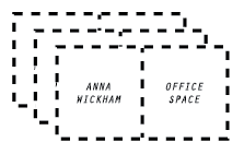
This is the final design for the Beach Gallery window vinyl advertising Anna Wickham's office space exhibition. It directly relates to her work and the promotional material. It's simple and not too 'loud' as the disrupt looking through the window but still simplistic enough to catch attention and communicate.
Website for Blue Rinse
The design of the website is almost complete and below I have documented a kind of step by step of how the website is to be navigated.
The homepage is all six of the section symbols enlarged and centred on the screen, I really wanted to use them at a larger scale and take advantage of their colourfulness and energy. It also make the initial layout of the homepage completely different to previous designs and to any clothing site that I've researched into so there is an element of originality in the composition.
The homepage is all six of the section symbols enlarged and centred on the screen, I really wanted to use them at a larger scale and take advantage of their colourfulness and energy. It also make the initial layout of the homepage completely different to previous designs and to any clothing site that I've researched into so there is an element of originality in the composition.
To uncover which symbol means what, the mouse needs to be hovered above the symbol and becomes a rollover image. When clicked a drop down menu appears below the symbol and displays several options (clothing types such as tops and jackets) and as the mouse moves across the options the are highlighted by a purple box. The filter option works in a similar way by clicking on the heading a menu appears with filter options. Navigation works by clicking the left and right arrows and allows you to browse the range of products and by clicking 'add to basket' adds that product to your online shopping bag which is indicated by a number appearing on the bag in the top right corner.
The only issue I have realised at this time is that the 'add to basket' gets lost in the background, so I'm going to design a button to replace it with.
The only issue I have realised at this time is that the 'add to basket' gets lost in the background, so I'm going to design a button to replace it with.
Window vinyl development


I had to keep the window vinyl quite simple and not be too 'loud' when placed in a gallery window but still stay true to the design direction of the project. From my rough ideas I took several forward into digital experimentation and reflecting on them now I can see that the box that is completely dashed is the strongest so I'm going to take that forward and use that one.
blue rinse bag development
I've finalised the designs for the store bags and have decided to go with two colour variations. one set gold and the other fluorescent green. The designs have come from various sources of inspiration such as Saved by the bell and 1980's video game box art. The logo will be printed on the reverse side but without the logotype, I've done this because I want these to be purely visual and pattern based whilst still having a strong link to the store when being carried around in public.


Tuesday, 29 November 2011
Window Vinyl Ideas
Beach London have a tailored window vinyl for each exhibition, usually it is just a few lines of text or even several words but I wanted to push the idea of the exhibition branding further and extend it to the window vinyl.
Symbol button rollover experiment
I really wanted to take the shape symbol idea further for the website and wanted to have the shapes present instead of having words, yet for navigation purposes I needed to communicate to the user which button was which so created a rollover image button where if the mouse hovers over the image the name of the page that the link directs you too is displayed. I will probably use a different typeface other than mistral as it's a bit too cheesy.
Monday, 28 November 2011
Web Icons - Rough visual idea generation
I want to create bespoke web icons for each link on the website. For example I want an Icon that will be used for the women's department, I'm trying to make them quite random but they defiantly must have the feel of blue Rinse's new 80's new wave feel about them. Below are some rough ideas of composition, shapes and patterns for the icons.

Logo type ownership.

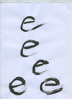
 After talkin to Ric Bell several weeks ago, he advised me to experiment with developing my own lettering for the Blue Rinse logo. So I finally got round to buying a some Ink and borrowing a brush and set to work making letters. After making several of each I chose one and edited it in illustrator however I chose to keep the B and the R in Mustang (the original typeface I used) and edited them slightly to fit in with my own lettering. The reason for this was the the letters we so strong that I couldn't reproduce them at a high standard so edited them to compliment my own type whilst still remaining visually strong characters.
Swing tag development

These are the swing tags for both the men's and womenswear. The womenswear swing tags have been inspired by 1980's new wave ear rings and colours selected from found ear rings and altered to compliment the brand colours.
The menswear swing tags have been designed to visualise the pixelated computer age of the 80's, I've emphasised this by pixelating the Blue Rinse logo and design the tag to look similar to a computer screen box.
The only issues I have with these is that I did not put a website on the reverse of the tags which I will amend before going to print.
Blue Rinse shopping bag development
shape, symbol pattern development
Some rough sketches of initial ideas for the Blue Rinse web icons.
I want to get the new wave and cheesy computer art graphics look whilst still being aesthetically comfortable and not horrible. 'Crap is good' kind of thing not actually crap though.
Tuesday, 22 November 2011
ISTD mock up

Mock up for my ISTD magazine, the stock works perfectly for the concept, i had a few issues with printing as seen below, the weight as so low that the stock got caught and chewed up in the printer, but I've had a chat with James from digital print and he said that his printers could manage it but just in case have a few back up sheets.
Wednesday, 16 November 2011
Layout Development
Subscribe to:
Comments (Atom)


