Showing posts with label Top ten. Show all posts
Showing posts with label Top ten. Show all posts
Monday, 14 February 2011
Rapunzal Ident
> Just finalising the Rapunzel Ident. Needs a solid layer at the start to fade away and possibly tweak the timings but other than that I'm quite happy with this.
Red Riding Cap (Hood) Before Final Edit
> This is almost complete, I just have to tweak the timing of the wolf's position, he moves into view too early and starts animating halfway through.
>Unlike the other idents, I needed the character to stop walking (on the spot) and move with the environment and allow the other character (the wolf) to move into view as if Little Red Cap had stopped walking as soon as she saw the wolf walking towards her.
> I retimed the positioning a little so the wolf comes onto the screen just has the limbs start to animate.
> To sync the movement of the wolf with it's limbs I moved the centre point of each limb to where I imagined it to be connected to the body (as if it was a joint) and altered the rotation over time. I also applied the puppet pin tool, which I had been experimenting with and found that I could place pins on the legs where the joints would be and move the legs as if they had natural movement. It still isn't as fluid as a real moving wolf but I think the effect gives more life to the animation and is as realistic as a silhouette is going to get.
Sunday, 13 February 2011
TV Channel
Saturday, 12 February 2011
sleeping Beauty Final Ident
>Not completely happy with this one. Most probably because I tried animating it from a different angle which didn't work as well as I'd hoped. I'm going to return to this soon and experiment with the camera and see what effect that gives me.
Friday, 11 February 2011
Sleeping Beauty 2D Layers experiment


> With this version instead fo using the 3d camera tool I adjusted the scale key frames of each layer and moved the anchor points so that the image would appear to zoom into the screen in the right position and as if the camera was moving away from the objects. It was a lot easier and quicker to edit this way compared to converting layers to 3d and applying the camera tool, I definitely preferred this technique.
Hansel and Gretel ident
>Almost complete just need to tweak the two characters movements at the end of the video, the background stops moving so it looks as if Hansel and Gretel are walking on the spot//
> I decided to fade the bbc four identity at the bottom of the screen, well within the title/action safe guides and be constantly visible through the rest of the video.
Organising Workspace (Pre composing/nesting)

> I found that animating separate scenes started to fill up my workspace and it got a little over crowded. So I started to consolidate related layers into separate compositions making it so much easier to edit certain stages of the title sequence and along with colour coding the compositions made it so simple to navigate through my files.
Thursday, 10 February 2011
Character colour

> Grey works well with the environment, not too dark not to be seen and not to bright so as to take attention away from the characters surroundings.
I really want the environment to be as important as the character and still be able to distinguish the characters features and not be lost in the background and I think this colour option achieves this.


> White comes out really well, brings out the character in all it's detail and sets it apart from the background. However I think it's too bright for the tone that I'm trying to achieve.
Images used in my videos
> These are the images that I vectored from my drawings then imported into After Effects. I tried making them as simple as I could without losing their distinctive characteristics.
Wednesday, 9 February 2011
Music choice
Philip Glass - It was always you, Helen
I chose this song to use in my videos because of it's chilling melody. It's a song that I can imagine being scary but enchanting at the same time similar to how the Brothers Grimm stories are meant to be.
H&G sting with music and ident
> I've now added music to the sting along with the BBC FOUR ident although I have still to animate Hansel and Gretel. To make the Identity and program schedule info work I've also placed in two shape layers that fade in and out, these layers start and finish the video making it more smooth and allowing the white type to be visible at the end//
Tuesday, 8 February 2011
Making the background - Digital

> After filling in the shapes black I altered the opacity of each layer so that the trees that were going to be the furthest away were at the lowest opacity and then gave each layer a gaussian blur to give the effect of fog, This was also to help the characters and main assets stand out clearer in contrast.


> The atmosphere and tone was both inspired by the Brothers Grimm stories and the video game Limbo. I'm really happy with the outcome and for each scene I will alter the composition of the layers and re-arrange the trees to suit the different assets.
Monday, 7 February 2011
Making the Background


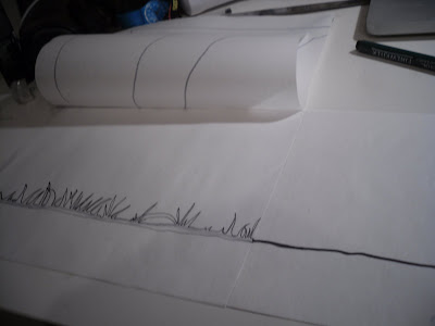
> The most practical method I could imagine to draw out the layers for my animation was to lay out my paper in layers and draw out all the elements I needed, this gave me the chance to see what the full image was going to look like layer by layer before even scanning things onto the computer. It saved a great deal of time as I knew exactly which layers went with which and the whole thing came together pretty smoothly when I started editing things on Photoshop and Illustrator//
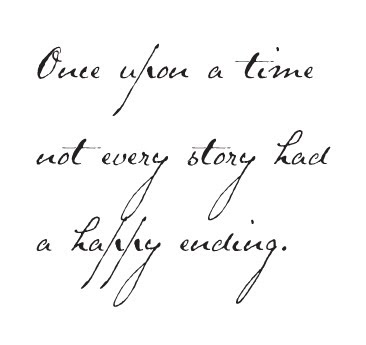
Calligraphic Type
Monday, 31 January 2011
1st version of intro for title sequence
Rough version of title sequence intro//
> This is the basic version of my idea, I plan on redesigning the forest and hand rendering the type, but I think it Illustrates my idea of how I want the atmosphere and style of the video to look like//
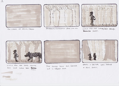
StoryBoards
Subscribe to:
Posts (Atom)


